Clarity is a design decision.
Selected work
Case studies grouped by the industry they served. Client names are shared inside the protected pages.
- Industrial
- Healthcare
- Finance
- Insurance
- Education
- Government
- Marketing
- Media
- Consumer
-
Lead UI/UX & Product Designer · 2025-2026
Industrial safety
Packaging, documents and digital interfaces for protective equipment, moved to one brand across three continents. 2,000+ assets, 25 languages, one year.
Open case study
 Case study is password protected
-
UX/CX Lead · 2022-2025
Insurance
A client self-service app and international web portals for a global insurer. Three products, three markets, three design systems.
Open case study
 Case study is password protected
-
Senior UI/UX Designer · 2022-present
Healthcare finance
A healthcare financial platform, from marketing site to client portal and patient billing.
Open case study
 Case study is password protected
-
Lead Designer · 2022-2023
Healthcare
A confidential internal platform for a health system innovation lab, plus new pages and templates for its public website.
Open case study
 Case study is password protected
-
Lead UI/UX Designer, Creative Lead · 2017-2022
Marketing and education
Research, websites, branding and campaigns for finance, education, industrial, video and photography clients.
Open case study
 Case study is password protected
Some of this work is under client confidentiality, so the case studies are password protected.
Protected
Want to view my case studies?
My client work is shared privately. Enter the password from my resume or application email to see the full list.
How I work
Explain it where it appears.
Policy terms get a plain-language explanation beside them, through tooltips and status tags, instead of a glossary somewhere else.
See the insurance studyDecide the order before the details.
At 2,000 assets, settling the sequence and the rules early mattered more than any single design choice.
See the industrial safety studyRegulated does not have to mean rigid.
Working closely with legal, quality and compliance teams made it possible to meet strict requirements and still write for people.
See the insurance studyResearch keeps design honest.
Testing and journey maps point the work at real problems instead of assumptions.
See the marketing studySystems that keep work consistent at scale
I build the tokens, components and templates that let teams ship without redesigning the same thing twice, and I decide what must stay fixed and what is free to change.
Tokens
Named color tokens and a clear type system that hold across iOS, Android and responsive web.
Insurance
Components and states
Reusable components with defined default, hover, focus and error states, ready for engineering. 100+ components across three systems.
Insurance
Templates
Locked brand zones and flexible content zones, so print and digital assets stay on brand at volume.
Industrial safety, healthcare
Shared patterns
One set of layouts and components behind marketing sites, product screens and sales material.
Healthcare finance
6 languages 3 writing systems 2 reading directions 1 component
Brand mark
Color, type and grid never change.
Read the instructions before use.
Certification marks and warnings, set by region.
- Script
- Latin
- Direction
- Left to right
- Text length
- 100% of English
- Component size
- Unchanged
Experience
Roles, 10+ years
-
Curae Health
Senior UI/UX Designer, contract
Jan 2022 to Present
-
Tata Consultancy Services
UX/CX Lead | Senior UI/UX Designer | Senior Packaging Designer
Jul 2022 to Jul 2026
-
Hedy & Hopp
Lead Designer, contract
Jan 2022 to Jan 2023
-
Token Agency
Lead UI/UX Designer, Creative Lead
Aug 2017 to Jan 2022
Education
-
Universitat Politècnica de Catalunya
Master's, customer experience
Apr 2023
-
Universidad Autónoma de Guadalajara
Bachelor's, design engineering
Dec 2021
Certifications
-
Google
UX Design Professional Certificate
2022
-
Microsoft
Azure, Azure AI and project management
2023
-
Adobe Creative Cloud
Illustrator, Photoshop, Premiere Pro, InDesign
2025
- Product and UX
- Product design, UX strategy, interaction design, information architecture, user flows, wireframing, prototyping, responsive web and mobile.
- Research and CX
- User research, usability testing, journey mapping, service design, customer experience, A/B testing, conversion optimization.
- Systems and leadership
- Design systems, component libraries, reusable patterns, design governance, stakeholder management, team leadership, cross-functional collaboration.
- Creative
- Branding, creative direction, graphic design, marketing design, packaging, visual design, videography, animation.
- Tools
- Figma, FigJam, Adobe Creative Cloud, Jira, Webflow, WordPress.
Paper and pixels
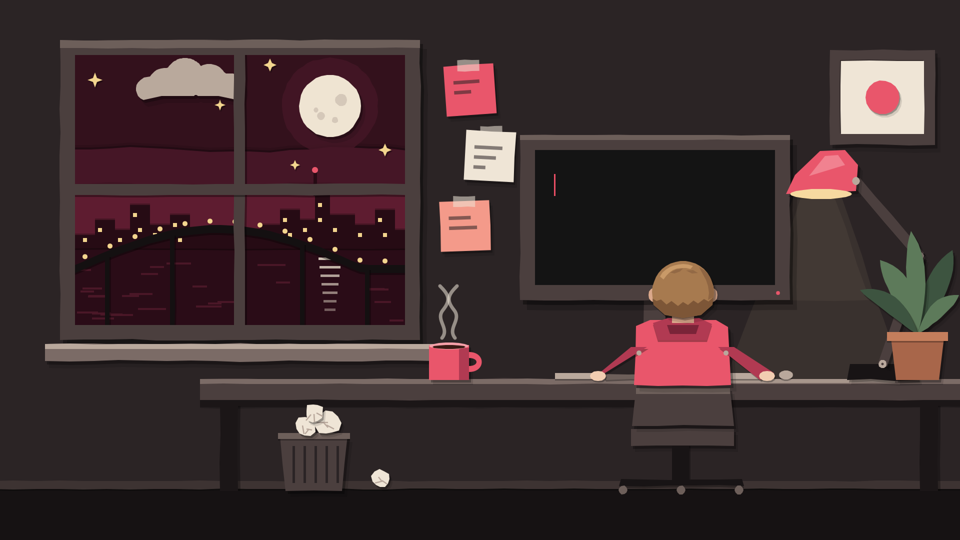
The desk from the film, made twice: once in cut paper, once in pixel art. Drag the line to compare them.
Cut paper
Every piece is vector, cut with edges that are never quite straight, lit by two shadows and a paper grain. It moves like stop-motion, about twelve drawings a second.
Pixel art
The same room at 192 by 108 pixels, drawn from one sprite sheet and only ever scaled by whole numbers. Both versions run the same loop: the line is typed, then the button is pressed.